The Story Behind Our New Brand
A logo is a powerful tool for the sighted population. It is said that 90% of information transmitted to the brain of a sighted person is visual, and visuals are processed 60,000 times faster than text. Visual branding can create moods, evoke emotions, and tell stories of the institution in a nanosecond.
Meadville Lombard unveiled its new logo with the launch of the new website in January 2018. We rebranded the school this time based not on a marketing strategy, but on listening and learning, and on our deep desire and intention to dismantle white supremacy culture.
In the summer of 2016, six months after I joined the Meadville Lombard staff, we embarked on the much-needed website redesign project. A working group was convened to determine what we needed for the new website, solicit proposals from web developers who had worked with higher-ed institutions before, and interview them. In early winter, out of 10 candidates, we hired a small women-owned web design/development firm in Maryland.
We didn’t have a plan to rebrand the school as we started working with the developer. There had been a drastic logo redesign in 2008, from the one with an ornate “ML Egg” in purple and green to the more modern one with a gold arc in black rectangle. The gold arc in blue rectangle logo was a refreshed version of it, created in 2012. We don’t have a record of why any of these colors were chosen. Since I had redesigned all marketing materials only six months earlier with the gold and blue, we decided keeping the logo and color scheme would be better for brand awareness and marketing at that point.

(1999)

(2008)

(2012)
Then the Spring of 2017 happened. The controversy over the Unitarian Universalist Association’s hiring practices exposed white supremacy culture deeply embedded within the Unitarian Universalist movement. Some of my colleagues and I were just starting to brainstorm ideas for our exhibit booth display for the upcoming General Assembly. Like most institutions that are historically white, Meadville Lombard had not been immune to white supremacy culture. When the UUA’s controversy unfolded, we had been working with consultants in an attempt to change our inner culture for over a year. We knew we had to be intentional about creating a display for that particular GA; it would have to represent our resolve to decenter whiteness and become a truly multicultural, inclusive community. I did some research and started designing elements for the display. Soon I realized that the school’s gold and blue color scheme didn’t work well for a “multicultural” feel. It felt very white and European—think flags of EU, Sweden, Ukraine. The logo didn’t work on a black background. So I decided not to stick with it and let my imagination and multicultural-ness flow.
The result was bold, bright, life-giving colors on a velvety black background. The new image I created for the Fahs Collaborative’s Beloved Conversations also added a multicultural flavor. At GA in late June, many people commented on how it was colorful, vibrant, and different from our previous years’ displays. One of them was Connie Simon, MDiv ‘18, who was finishing her second year of studies at Meadville Lombard and was the president of the Student Advisory Council. She said, “Tomo, this is so beautiful. I’ve been talking with many students and alums; we want THIS to be Meadville’s feel. This is who we are; we want this to be the representation of us.”
That comment changed everything. It made me think of that “this isn’t working” feeling I had when I tried to make the design with gold and blue, and how free I felt when I let go of that color scheme. I was also learning about Human-Centered Design at the time. Branding is usually something that is decided and shared in a top-down fashion, rarely a bottom-up proposition. I thought if we didn’t change the branding of the school after hearing what Connie said as a seminarian of color and the representative of the student body, we would be ignoring what our students wanted and forcing what we thought would be good for them. With the Website Working Group’s blessing, I contacted the web developer right away. They were a mere week from giving us the first presentation of the site design. I asked if we could change our minds about rebranding and have them design a new logo and create a new brand for us. They said they could, with $30,000 extra and a major delay in the site development. We didn’t have any extra in our budget, so I volunteered to do the logo and branding. The web developer gave me a week. Yes, a week—to determine the direction of the institutional brand that would make a statement and better represent us in those volatile times.

(2018)
That was how the new logo came to be. I wanted to convey many things in this logo—modern, innovative yet grounded in heritage, multicultural. I also wanted this new logo to be “multicultural” itself, suitable for different applications, including on a black background. I found out that the school color of Lombard College, our Universalist heritage, was green. Meadville Theological Seminary, the Unitarian side of our heritage, didn’t seem to have a specific school color. So I made the “ML” in green, with a hidden upward arrow to suggest our aspiration to stay progressive and innovative. The left arm of the “M” with multicolored stripes represents a ministerial stole. I kept the right arm of the “M” without a stole to represent our graduates who serve in capacities and roles other than stole-wearing ministers. For the stripes, I picked colors of significance from different religious traditions and cultures:
- Orange/Saffron: the sacred color in Hinduism and Buddhism, representing fire that burns away impurities. Orange also signifies the quest for knowledge.
- Blue: In Christianity and Judaism, blue signifies sky/heaven and spirituality. In Buddhism, blue is the coolness that transforms anger into wisdom. In Hinduism, blue is a symbol of determination and strong character.
- Yellow/Gold: the color of knowledge and learning in Hinduism; the color of royalty, spiritual wealth and purity in Kente cloth from Ghana.
- Grey: The color of ash in Kente cloth signifies healing and cleansing rituals.
- Green is also the color of Islam.

The website development resumed with the new color scheme and logo a week after it was paused, and in collaboration with the web developer, who added purple to our colors, we created a new feel of the school with vibrant colors that better represents us.
As the new website was taking shape, we also saw a need to reinvigorate the main common area of campus we call Atherton Lounge. In 2011, the school moved from stone edifices in the University of Chicago community in Hyde Park to the ultramodern Spertus building in the South Loop, but the walls were still decorated mostly with archives. The north wall of Atherton Lounge had the largest collection: framed archival photos and some contemporary class photos were flanked by two large portraits of white men—Harm Jan Huidekoper (1776-1854), the founder of Meadville Theological Seminary, and Franklin Southworth (1863-1944), the 5th president who oversaw Meadville’s move to Chicago and the merger of Meadville Theological Seminary and Lombard College.

Atherton Lounge is where our students gather and lead vespers or morning worship services, and where we have ingatherings. This wall of the lounge is the backdrop to the podium and everyone faces this wall while participating in those activities. How could we truly decenter whiteness while the background to the contemplation included two powerful white men, one of whom benefitted from stolen land of Indigenous Peoples? We decided it was time we retired the portraits along with the old photos and gave this wall a makeover.
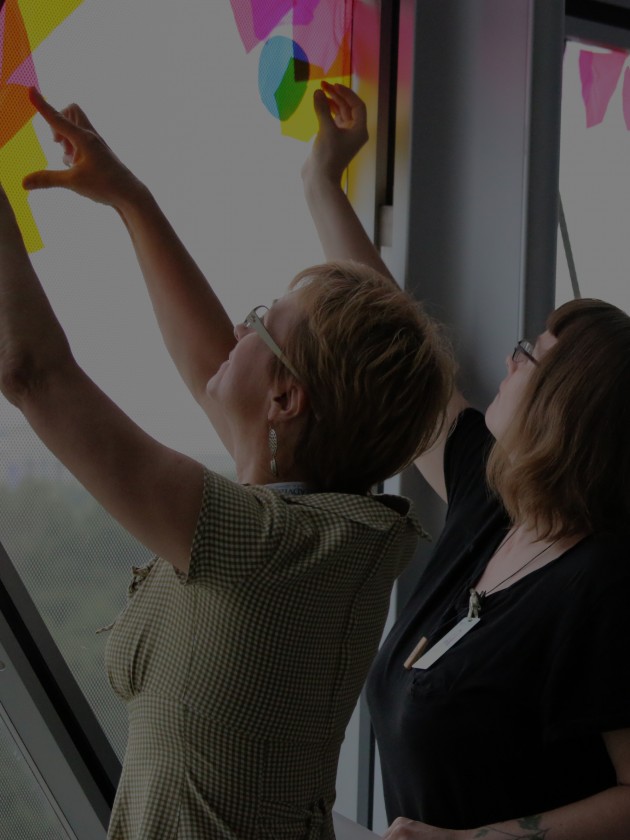
I thought we needed a piece that symbolized what Meadville Lombard does best: educate and send forth religious leaders who would bring to the communities they serve spirits and skills to fight for justice and equity, who would spread hope and healing. I thought of the flame of a chalice, the symbol of Unitarian Universalism, spreading from MLTS to the wider world in all colors of the rainbow, just like our students who are all unique and brilliant. I thought of stained glass windows.
Et voila.

We hung this new art during the last week of December.
On January 4, 2018, we introduced our new logo and website to the students who were on campus for January Ingathering and Signature Courses. Thus began a new chapter of our journey.

Tomo Hillbo
Director of Communications
Tomo serves MLTS in many aspects of communications. She is passionate about sharing the stories of Meadville Lombard, including creating visual representations of the school.
Read more about Tomo